
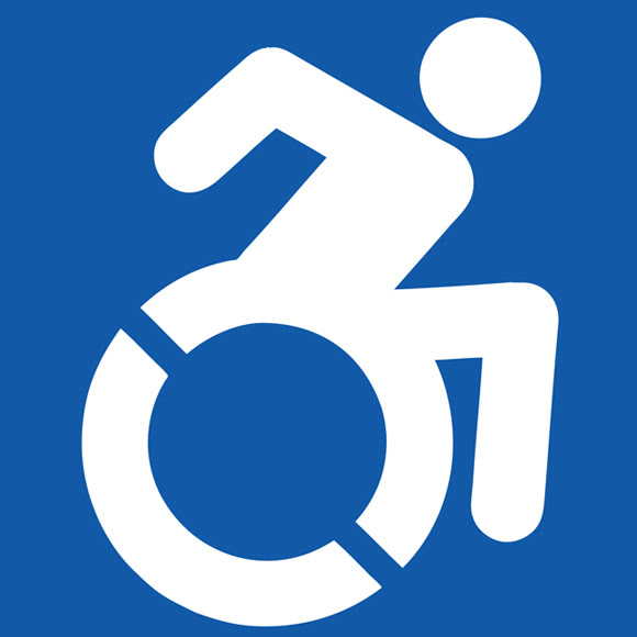
Accessibility Logo, Courtesy of Accessible Icon Project
New York Governor Andrew Cuomo has signed a new legislation, creating a new policy for accessibility. The law amends existing New York State law, requiring that the word “handicapped” be removed from state signage, or replaced with a different term. The law also creates a new logo for accessibility.
A press release about the new legislation points out that, “One of the largest concerns is that existing signage and language emphasizes the disability itself, rather than the person. The current universal symbol for a person with a disability represents an individual with a wheelchair, which will be updated on all new signage to portray a more active image.”
The new accessibility logo depicts a wheelchair in motion, with the person using it bent forward. Upon first glance, it’s not hard to envision a wheelchair racer. The original symbol, which has entered public domain, was designed in 1968 by Danish design student Susanne Koefoed.
Opinion of the new logo, designed by the Accessible Icon Project, is mixed. Much of the criticism comes from the obvious observation that it looks too much like a wheelchair racer to be taken seriously.
“It makes you think of Paralympic athletes, of wheelchair races and speedy movements,” said Barry Gray, who is a member of the International Organization for Standardization, “But the symbol has to work in static situations. Part of its job is to mark wheelchair spaces in public transportation or indicate refuge in emergency situations, as well as lifts and toilets.”
“The arm pushing a chair is symbolic,” said Sara Hendren, of the Accessible Icon Project, “Icons are symbols, not literal representations.” Hendren also believes that Gray’s other criticism, that it invalidates other disabilities, is off the mark.
Certainly the new logo is going to cause some discussion. A few people in our office were a little confused about the new logo, too. We’re not entirely sure what might come out of it, though. The fact that the current one is so ubiquitous and simple might make it hard for the new logo to gain any traction and credibility. Just looking at it the first time is confusing. Perhaps a couple of tweaks might be in order for the logo.
As for New York State’s new regulations, removing the word “handicapped” and replacing it with “accessible” is a long time coming. We applaud New York State’s new person-first accessibility language.
Other Recent Posts
- The Americans with Disabilities Act Turns 24, So What?
- Evanston Parklet Opens!
- Top 5 Businesses at Access Chicago Expo
- Get Access To Planet Access Company Store
- Nordstrom Inspires: Features Models With Disabilities
Join Over 3,000 Others Who Get Our Useful Articles: Subscribe to our free newsletter.
About the Author:
This article was written by our jjslist.com Intern Paul.

1 Comment
I enjoyed going to your webiste. I rarely leave comments,
but
you definately up deserve a thumbs!